摘要:有10余年从业经历的汽车交互设计专家JeongYoun Choi 通过梳理汽车工业中UI/UX发展史和她的从业经历,深度解析交互设计原则,探讨未来汽车工业中的设计方式和发展趋势。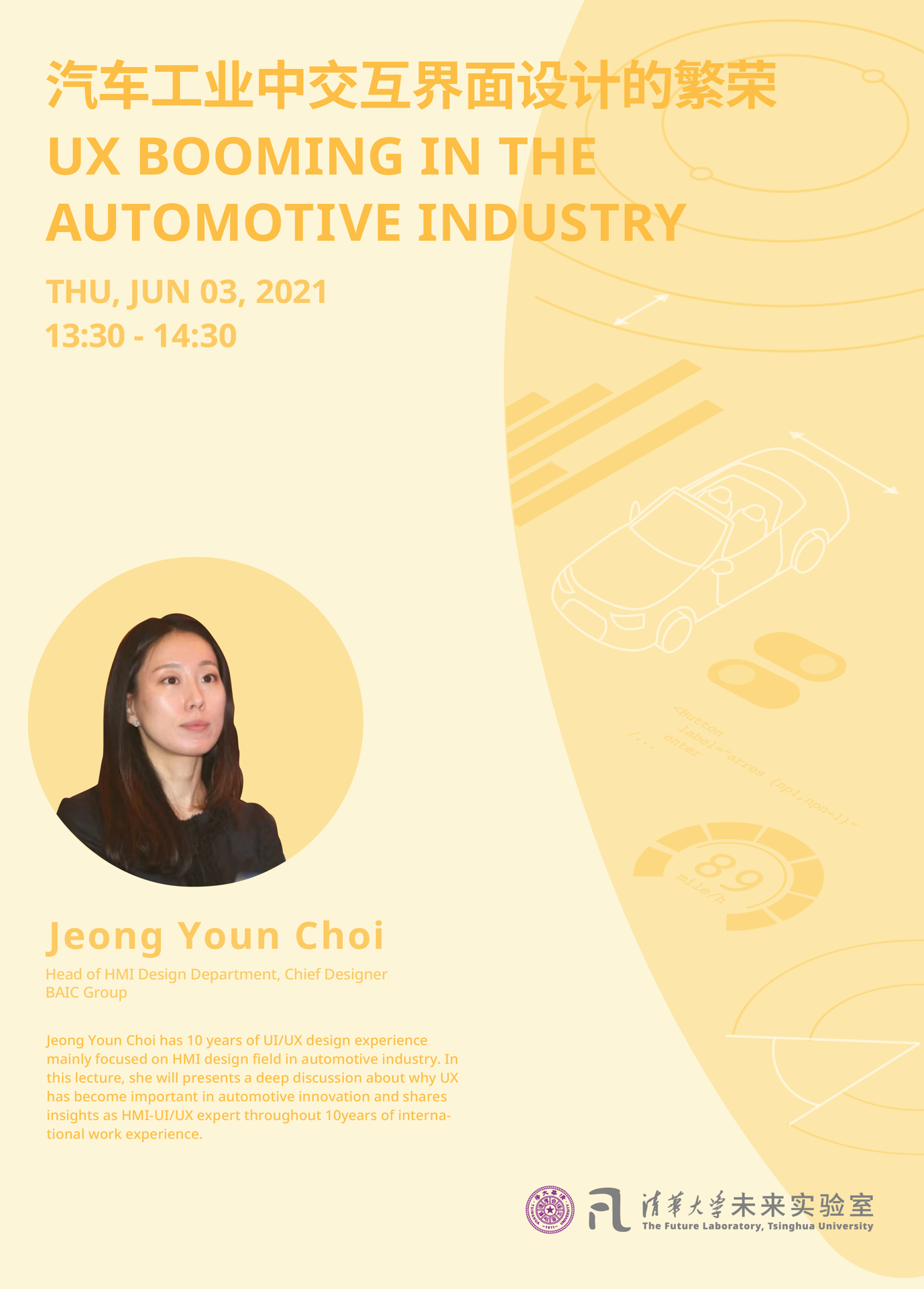
讲座概览
In this lecture, JeongYoun Choi will present a deep discussion about why UX has become important in automotive innovation and share insights as HMI-UI/UX expert throughout 10 years of international work experience.
讲座嘉宾- JeongYoun Choi
JeongYoun Choi has 10 years of UI/UX design experience mainly focused on HMI design field in the automotive industry.Facing the paradigm change especially in the Chinese automotive industry, passion towards the great potential of UX design innovation in the industry lead her to China, working as HMI - UI/UX chief designer.
JeongYoun Choi has been worked at BAIC group, leading Arcfox, Beijing, Beijing off-road brands' HMI design, and will be working as an HMI expert at BYD from this summer.Before came to China, she worked as UI manager at Mercedes-Benz Korea, various automotive companies, and design consult agencies.
讲座实录

It's only about ten years. There was a time that we didn't even have a touch screen in the car. We had the android phone with a physical keyboard, and then followed with iPod. At the time, we already started to imagine how to create this iPod-like experience in the car. After about seven years later, that imagination came true with new UI systems. Drivers now can reach all the phone functions on the car screen. In the beginning, the UI and UX design was focusing on the physical buttons. Then we changed to the digital screen. But now we move to the entire car HMI (Human-machine Interaction) system.
We always say that the automotive industry has 100 years history. People always concentrate on the outside looks during the long history when they talked about the car design. However, when Mercedez Benz releases a new series collection this year, the first image they show to the world is their new HMI system. Regarding this huge change, the automotive industry becomes more and more focus on HMI design. We shift from cluster behind the steering wheel to even one big touch screen beside.
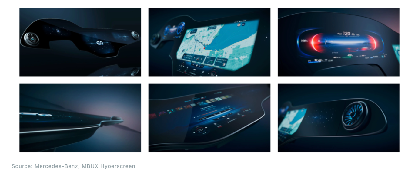
The first process in our team is focusing on how to provide the user a more immersive user experience from the lower panel, IP, and screens. The contents from the screen in UI/UX design have many details, like the color choice, the graphics, and the layout. All these decisions need the designers to consider what kind of experience they want to provide carefully. With the development of new technology, we also need to think about the character of the AI assistant and the implantation of technology like facial recognition.
Why do we need to spend more time on UI/UX now in car design? We live in an era facing these blooming technology and innovations. From the keywords in 2020 CES, we see what kind of driving people are looking for: AI, mobility, 5G, connectivity, etc. The car has become another smart device, more than just transportation. In the future, the vehicle will be more like a live creature, a customized experience space, and an empathy companion.

The three new HMI design approaches for the future car experience are theBasic, Value, and Culture.
The Basic
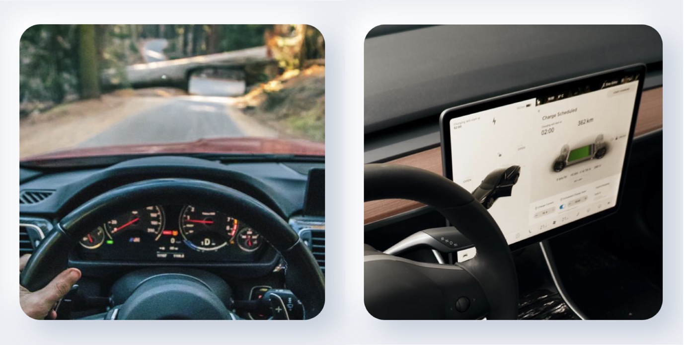
- Legibility:When we think about legibility as drivers, the old cluster design is time-consuming and indirect. Why do we need to show information with the thin needle and small numbers? So now we have the bold and large number to display the information with clear graphics.
Since the users are driving, the car interfaces are quite different from the mobiles and computers. Every choice needs to be retest. For example, different from allCAPITAL IN PAPER AND HANDWRITING, we found out that theCombination of Capital and Lowercase Lettersprovides the best legibility in the driving environment.
The sight of the drivers mainly focuses on the front. In fact, they don't look down to check speed information that much frequently. Thus, some companies start to move the information from the low cluster to the driver's side of the screen top, with the height and angle that the driver can glance at it easily.
- Glancibility:The sight of the drivers mainly focuses on the front. In fact , they don't look down to check speed information that much frequently. Thus, some companies start to move the information from the low cluster to the driver's side of the screen top, with the height and angle that the driver can glance at it easily.
The Value
We believe the user-center approach is the right way. In my HMI team, we take user interviews and user tests as part of the design process.
The Culture
Every market based on different culture has different aspirations. In case I mentioned at the beginning, after this Japanese brand car launched the American market, we got complaints about difficulty in using this Japanese HMI system. Thus we needed to study the market and users closely in the different regions.
I want to bring another case to present the user-center approach and how the market adjusts to the users. When we worked on a german car HMI system in Korea, the wake-up word for the speech control system didn't work. This is because the pronunciation of the brand name in the wake-up word is different from German and English. Therefore, we collaborated with the Chinese market team and reached out to the headquarter. Now in these two markets, the wake-up word is customized to the local language for better control.
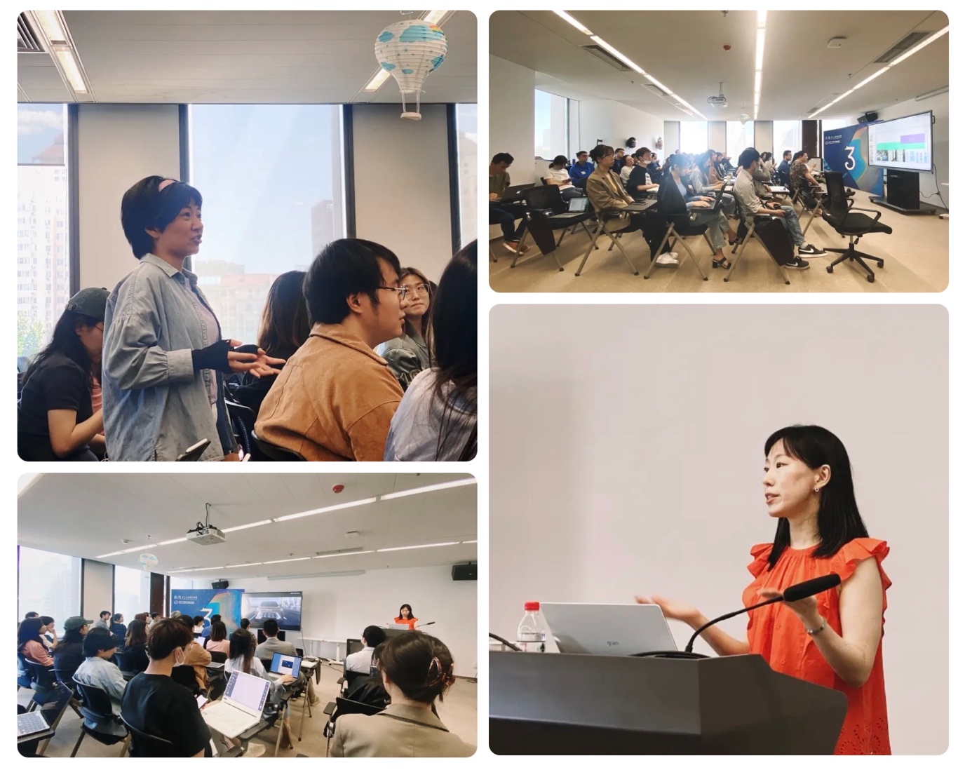
These are my main HMI design approach principles and preparation for the future car experience, thinking about the Basic, the Value, and the Culture as the key of our design.
Last but not least, we think about the UX first and styling design afterward. We apply this approach among all departments with deep collaboration in every step. The UX first principle and full cooperation help us develop a more dynamic HMI system with a better user experience.
* 疫情管控期间活动仅面向校内师生